

Countertop colour is absolutely essential in developing a unified kitchen design, perfectly bringing together cabinetry, flooring, and wall tones. The perfect colour draws attention to visual flow, giving the area intentionality and equilibrium. Whether vivid or subdued, a thoughtfully selected countertop colour improves the appeal of the kitchen by uniting the general design.
Countertop Colour For Kitchen Cohesiveness
Helps With Setting the Tone and Mood
Determining the mood and tone of the kitchen much affects the every day operation and ambiance of the space. The countertop among the biggest and most attractive elements in the room serves as the visual anchor from which initial impressions are developed.
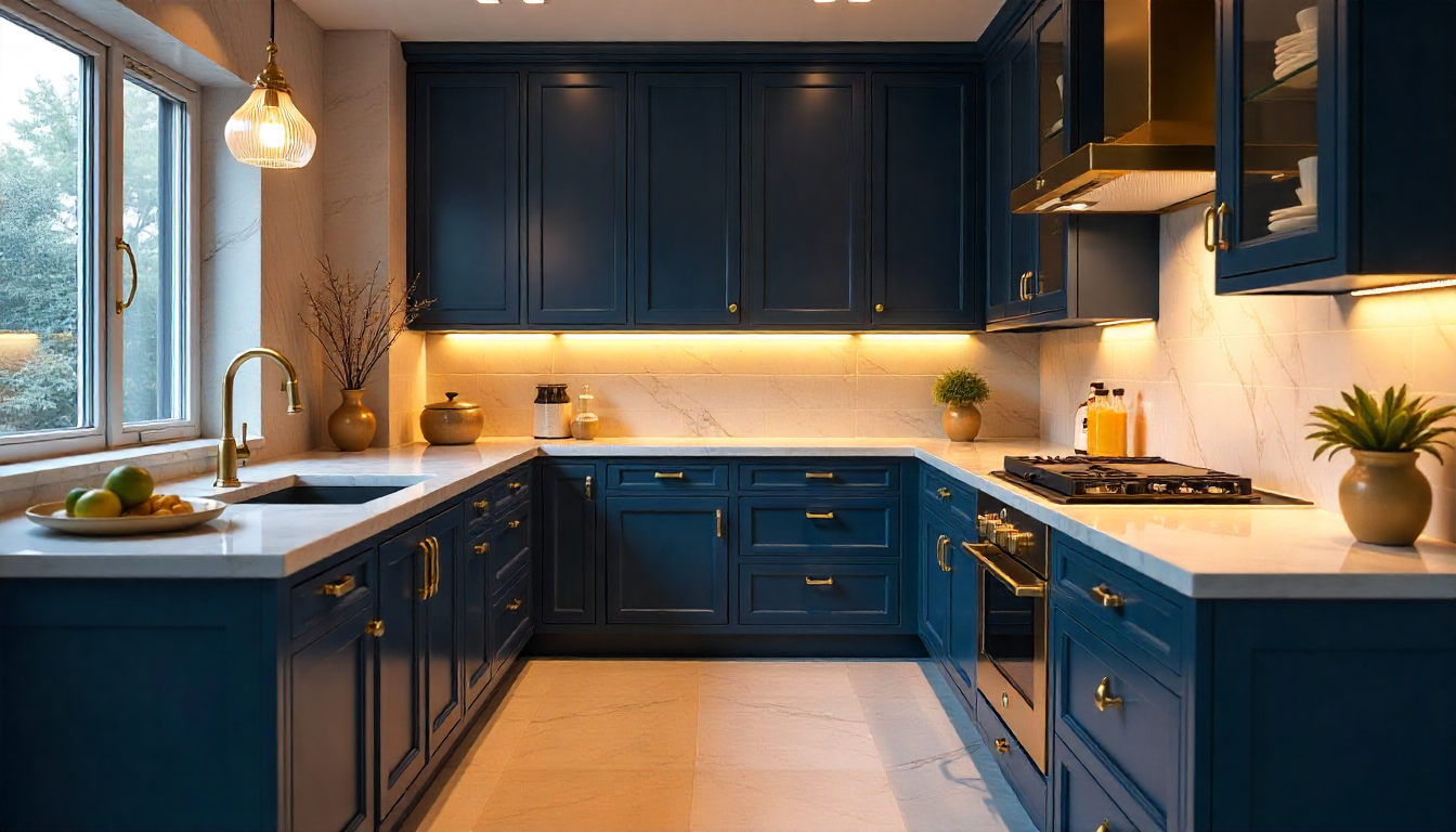
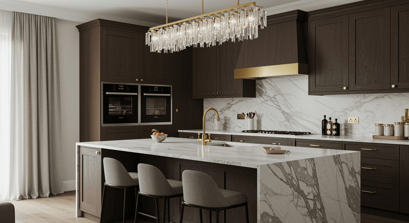
Opening the space right away and creating a serene, clean, and inviting ambiance that raises natural light are lighter countertop colours — white, cream, or pale grey. Homes desiring a streamlined, modern style or small kitchens would benefit from these tones. On the other hand, richer hues like charcoal, espresso, or deep green lend depth and riches and hence match modern or industrial themes, providing the kitchen a grounded, lavish atmosphere.
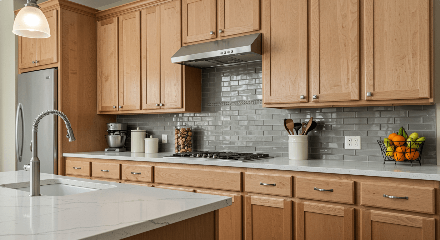
Warm hues like tan, taupe, or honey instil comfort and warmth for traditional or rural kitchens. Conversely, cool tones offer the calmness and composure sometimes found in modern, modest designs. Matte black finishes, for example, absorb light to make for a more The perfect countertop colour also improves lighting; an intimate ambience; a glossy white surface reflects sunlight beautifully.
Selecting counter hues that match your chosen mood and overall design theme enables homeowners to create a kitchen that seems and looks congruent. Their lifestyle is steady and passionate. At last the colour of the countertop acts as a powerful emotional trigger that shapes the character of the kitchen and the events occurring inside. it. not solely in a design decision.
Gives A Good Balance Of Visual Flow

Harmonising everything from cabinet to flooring depends entirely on countertop colour; therefore, guaranteeing the visual flow of a kitchen is adequately balanced. Since the counter top colour lightens nearby hues, it produces a smooth transition that links the area and maintains order.
Combining stainless-steel appliances with delicate grey counters and white cabinets, for instance, maintains a contemporary, airy look; a warm beige surface could just link wooden cupboards to neutral walls. Particularly in open-plan designs where the kitchen joins with living or dining areas, the right colour selection enables one to prevent visual mayhem.
Designers may swiftly steer attention across the room by matching counter colours to the overall palette, therefore avoiding sudden changes that disturbs harmony. A nice flow enhances comfort and gives the kitchen a more inviting appearance; hence, this harmony has both practical and aesthetic worth. Countertop colours might additionally subtly emphasise or de-emphasise certain design features; a darker counter could anchor a light-toned kitchen while a lighter counter could brighten a small room.
By finally unifying the design via colour harmony, one creates a kitchen that seems deliberate, well balanced, and elegantly attractive. Acting as The counter, the main design anchor links all other components to ensure the kitchen offers one coherent visual narrative rather than seeming like a gathering of unrelated goods.
Countertop Colour 3: Enhances Style Consistency
The counter top colour greatly influences the enhancement of stylistic consistency across the kitchen. Among the most visually prominent features, the countertop connects several design elements including backsplash, flooring, cabinets, and even appliances.
Choosing the ideal colour guarantees these components cooperate to create a constant and purposeful appearance. For instance, subtle colours like white, grey, or light beige would help a minimalist kitchen to improve simplicity and cleanliness. Warm browns or stone-inspired patterns — natural or earthy hues exactly complement industrial or rustic décor, hence adding charm and warmth.
Strong colours like black or deep charcoal can bring elegance and panache to contemporary kitchens and also keep harmony when used with fine finishes. Countertop colours can also complement or clash with cabinet tones to draw attention to texture and levels without fighting visually. Beyond appearance, coherent colour harmony promotes a good read a calm, welcoming, intentionally designed room generates a sense of serenity.
Counter colour defines the visual identity of the entire kitchen whether the aim is a traditional monochrome palette or a bold, modern mix. Choosing a countertop colour corresponding with the general design guarantees that every component from appliances to lighting feels connected, hence producing a kitchen that is both beautiful, harmonious, and balanced.
Great In Creating Focal Harmony Within The Space

Mostly determining the focal harmony within a well-coordinated kitchen design is the colour of the countertops. The countertop acts as the anchor linking all other design aspects from cabinets and backsplash to flooring and lights among the most visually stunning features.
Selecting the proper tint guarantees that the kitchen seems beautiful and harmoniously integrated rather than messy or scattered. For example, a neutral-toned countertop can provide a calm background that lets strong lighting or bright cabinetry sparkle; a contrasting countertop colour can also introduce a striking focal point that automatically guides the eye across the area.
By connecting the kitchen with neighbouring living or dining spaces via counter top colour, open-plan houses enable seamless flow among many regions and so aid in the linking of the two. Warm tones go well with natural wood finishes, therefore harmonising with other design decisions rather than conflicting with them; cooler tones complement modern metal features ideally. Uniform colour matching over surfaces also helps to clearly define the character of the kitchen and lend it a deliberately built look.
The harmony attained by matching countertop colours improves the whole design of your kitchen whether you're aiming for subdued sophistication or warm homely. Through deft use of colour inclusion, owners may design a kitchen that both serves and motivates a sense of visual harmony and serenity. where the countertop connects all the components employing a common design vocabulary.
Countertop Colour 5: Affects Perception of Space
The colour of your countertop has a significant impact on your kitchen's perceived size. Light-coloured countertops such as whites, creams, or light greys reflect artificial and natural light in smaller kitchens, giving off an airy, open feeling that visually expands the area.
With these hues less cluttered the kitchen gets, which also blurs the distinctions between surfaces and so expands its size. On the other hand, deeper counters such charcoal, black, or dark brown may offer depth and significance to larger kitchens hence fostering closeness and harmony. To guarantee visual harmony and so avoid stark contrasts that might cause a room to seem confined or scattered, the colour should match cabinetry, flooring, and wall tones.
Consistent colour coordination between countertops and neighbouring walls also improves the kitchen's flow by softly pulling the eye around the space. In open-plan layouts, the correct counter colour also divides rooms without physical barriers; lighter tones can subtly link the kitchen with the rest. While darker ones can ground it as a distinct central feature, living area complementary colours of textured or patterned surfaces add depth and interest without overcrowding the area.
Counter colour is an aesthetic choice in addition to a design tool that promises the control of spatial perception, illumination distribution, and emotional comfort. The appearance of Kitchen is consistent, useful, and aesthetically balanced.