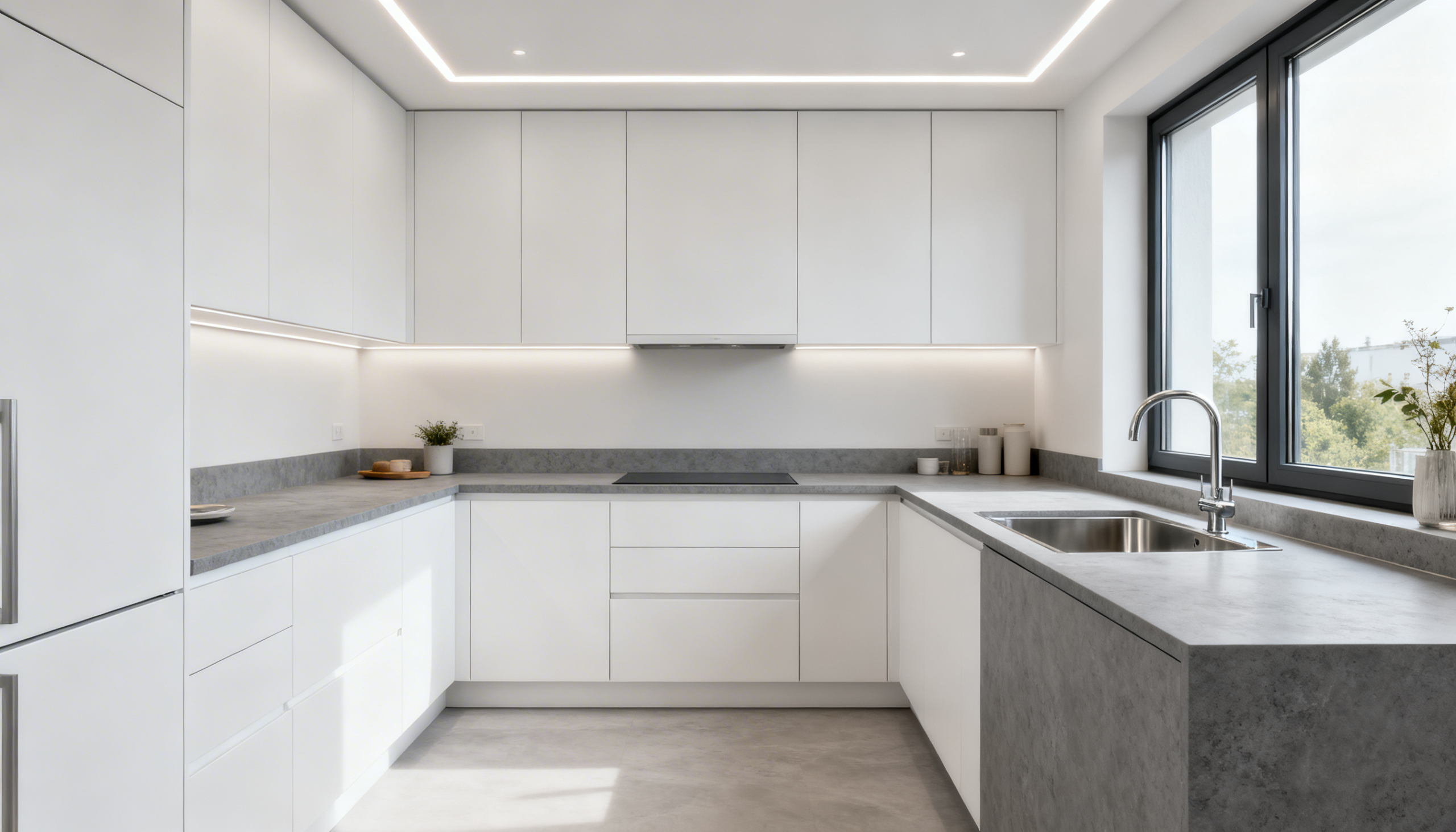
4 Ways to Stay on Top of Kitchen Color Trends!
As a homeowner living in Johor, you would want your landed house to be a reflection of your unique style and the latest trends in design. One of the most significant factors in achieving this is the use of colors to create an environment that is both inviting and visually appealing. However, with styles changing at a rapid pace, it can be challenging to stay up-to-date with the latest color trends.

Fortunately, there are several ways to keep your finger on the pulse of color trends, so you can transform your home accordingly. One option is to follow design blogs and social media accounts that specialize in home decor and color trends.
This will keep you updated with the latest trends and help you to incorporate them into your home's color scheme.
Another way to stay in the know is to attend interior design trade shows and home decor exhibitions, where you can explore the latest color trends first-hand. These events provide an excellent opportunity to see how different colors are being used in the latest designs and to get inspiration for your own home.
You can also visit home decor stores and showrooms, where you can speak to experts who can advise you on the latest color trends and how to incorporate them into your home. Many stores also offer in-store consultations, where a designer can work with you to create a color scheme that reflects your personal style while incorporating the latest trends.
Finally, one of the best ways to stay updated with color trends is to experiment with different colors in your home. This will allow you to see how different colors work in different settings and help you to find a color palette that you love. You can start by experimenting with accent colors and gradually work your way up to bolder color schemes.
By following these four ways to stay updated with color trends, you can transform your home into a space that reflects your personal style while staying on-trend with the latest color palettes.
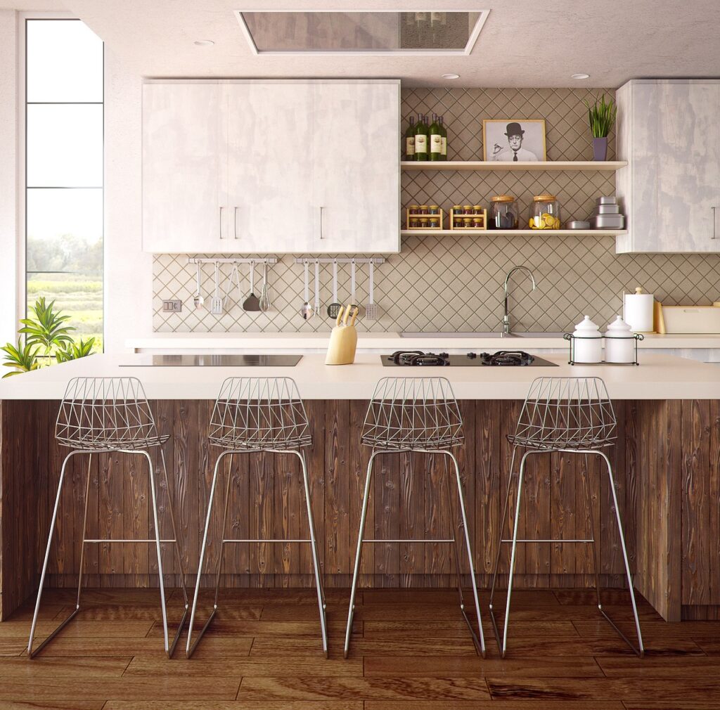
Here Are Some Additional Suggestions for Staying Up to Date With the Latest Color Trends for Your Kitchen.
1. Follow the Experts
Design gurus, color forecasters (like Pantone), and popular home decor magazines are your go-to sources. Pay attention to their “Color of the Year” picks – these are like signposts for upcoming trends.
Don't forget to follow relevant local blogs and social media designers to see how these global trends are being adapted for Johor homes.
2. Explore Design Inspiration
Pinterest, design websites, and even home renovation shows give you a front-row seat to the newest color palettes. Note how colors are used in kitchens, bedrooms, accent walls, and furniture.
Malay cultural events and traditional textiles can also be fantastic sources of timeless color combos!
3. Take Cues from Nature & Your Surroundings
Johor's lush greenery and vibrant cityscape offer endless inspiration. Incorporate those tropical blues and greens for a calming yet modern vibe. Balance bright colors with neutral tones for a sense of sophistication that suits landed homes.
Feng Shui elements, like red for prosperity or blue for harmony, can be beautifully woven through accents and decor.
4. Observe Celebrity Homes & Design Trends
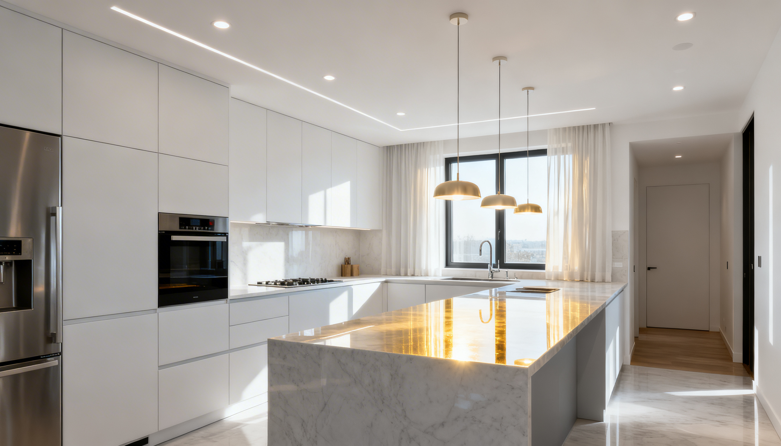
Love the bold choices used in popular home makeovers or celebrity spaces? Take notes! While a full-on replication might not be your style, observing how designers pair trendy colors with classic elements (think brass fixtures, textured marble) can spark your creativity.
Remember, it's about adapting trends to YOUR taste, not copying them exactly.
Bringing It All Together: Your Johor Home
The key is to use color trends as a springboard, not a rulebook. Start with a neutral base in your main living areas. This allows you to experiment with bolder accents on cabinets, feature walls, or even smaller appliances.
Keeping up with color trends ensures your Johor home stays fresh and vibrant and reflects your family's personality and a touch of the latest in global design.
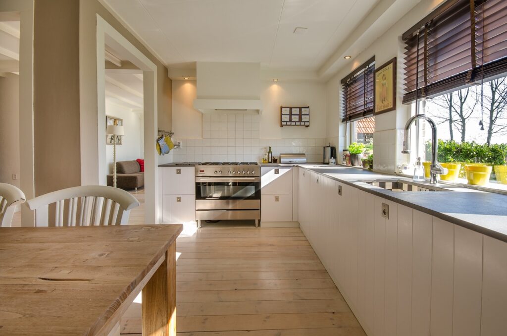
Extra Tip: Don't be afraid to consult a local designer! They can help you blend trend awareness with a deep understanding of what works well in landed houses in Johor.

